before
after
ConvertKit, a $40 million-dollar company, has attempted rebranding twice, both times receiving mixed reactions. In July 2018, ConvertKit rebranded as "Seva," a name inspired by the Sanskrit word for selfless service.
However, it faced backlash due to the deeply religious meaning of the word, as many thought linking selfless service to a marketing tool felt inappropriate and the company quickly reverted back to its original name.

Image courtesy of Kit
Last year, ConvertKit took another shot at rebranding, this time collaborating with Koto, a renowned agency known for its impactful work in brand strategy and design. Koto has previously worked with other major brands to create strong, memorable identities.

Image courtesy of Kit
Together, they crafted a new image for ConvertKit, now known as Kit. This rebrand was more than just a name change. It marked a significant evolution for the company, showcasing its ambition to go beyond email marketing and offer a complete toolkit for creators.

Image courtesy of Kit
Why the change?
Nathan Barry, the founder and CEO of Kit, explained in the rebranding announcement video that the change was about creating a simpler, more modern brand that aligns with their mission.
“Kit represents a complete toolkit for creators to build, grow, and succeed,” Barry said, emphasizing their commitment to empowering creators with versatile tools. The new name, “Kit,” represents a complete toolkit for creators to grow their audience and earn money.

Image courtesy of Kit
ConvertKit, trusted in email marketing for over eight years, has built a strong reputation for supporting creators. The rebrand to Kit shows that the company wants to go beyond emails and help creators in many more ways.

Image courtesy of Kit
What’s New with Kit?
The rebrand came with several updates:
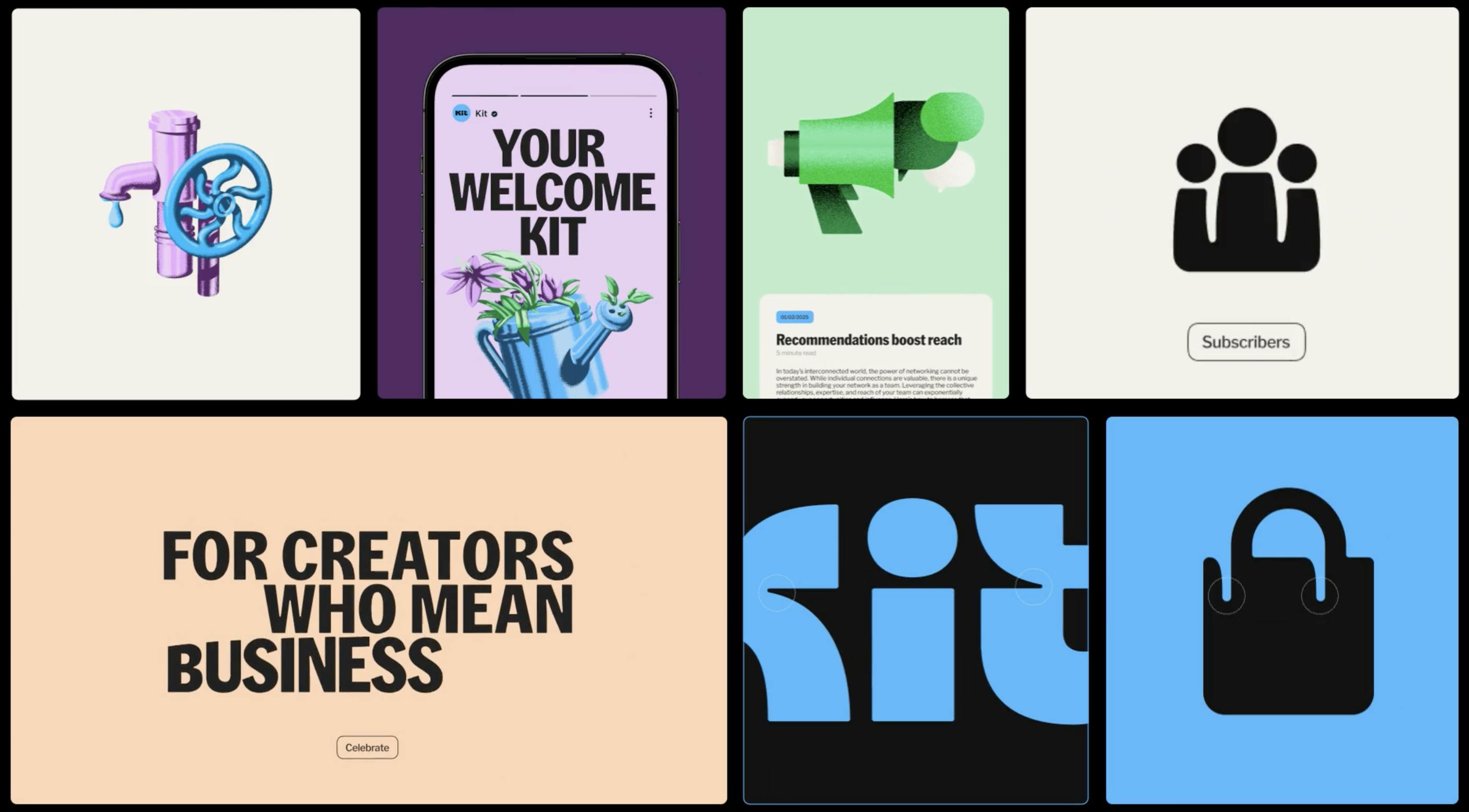
- A fresh new logo is bold and more confident with the small details designed to reflect Kit’s deeper purpose to connect with the creator.
- Kit chose bright blue to reflect energy and as a nod to its early days when blue was the original brand color.
- The typography - Kith Sans, created in partnership with Hot Type, adds softness and expressiveness, symbolizing growth and connection.
- A cleaner user interface to make the platform easier to use.

Image courtesy of Kit

Image courtesy of Kit
Kit added new automation and audience management tools as part of its rebrand. A big part of this is the app store, which introduces five apps to make the platform more useful:
- KitBoard: Helps manage customer relationships by showing sales pipelines, tracking customer conversions, and keeping up with prospects easily.
- Wordsmith: Automatically transforms YouTube videos into email newsletters to notify subscribers about new content and round-ups.
- SavvyCal: Integrates a 1:1 booking widget into emails, syncing appointment details back into subscriber profiles.
- Mighty: Connects the Mighty community platform, allowing seamless content integration into Kit.
- SegMetrics: Offers detailed insights on subscriber engagement and conversions through a dashboard developed with SegMetrics.

Image courtesy of Kit
These apps highlight Kit's transformation into a fully customizable platform, empowering creators to manage and grow their businesses more effectively and in innovative ways.
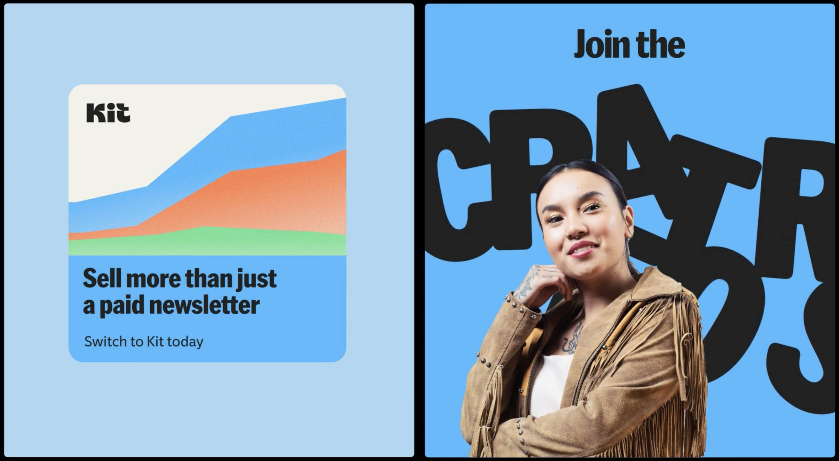
Kit’s tagline, “Tools for Creative Growth,” reflects its new focus on helping creators succeed at every step. The rebrand highlights Kit's commitment to supporting the growing $250 billion creator economy by offering essential tools to help creators expand their businesses.

Image courtesy of Kit
The rebrand shows Kit’s goal to be more than an email marketing tool. It’s now a platform that helps creators grow in many ways. Nathan Barry said,
The rebrand is not just about a new name. It’s about showing creators we’re here to support them with better tools and new ideas.
With this fresh identity, Kit is ready to help more creators succeed and continue being a key part of the creator economy.