
before

after

Interview with Grace Walker, Creative Director at Spellbook
Can you introduce us to Spellbook and share the story of its early development? What was the history before it transitioned from Rally to Spellbook?
Spellbook creates AI software for lawyers, helping them review and draft contracts much faster. The company originally started as Rally, a tool focused on templated document automation.
Spellbook began as a small experimental project, initially meant as a lead magnet. However, lawyers quickly embraced its AI-powered contract review features and Spellbook had over 30,000 lawyers on the waitlist within 3 months of launching.The team saw growing momentum around Spellbook and gradually shifted focus from Rally to fully developing this new tool.
Image courtesy by Spellbook
Although I joined recently, it’s clear that experimentation and discovery played a big role in shaping the direction of the product. The company pivoted from its original direction, recognizing how impactful Spellbook was for lawyers. By improving efficiency, our tools help lawyers assist more clients, streamline their work, and enhance their quality of life, aligning with the mission to make legal services more accessible.
Spellbook was founded by three co-founders: Scott Stevenson (CEO), Daniel DiMaria (Chief Revenue Officer), and Matt Myers (Chief Operating Officer). Today, the team has grown to about 65 people.
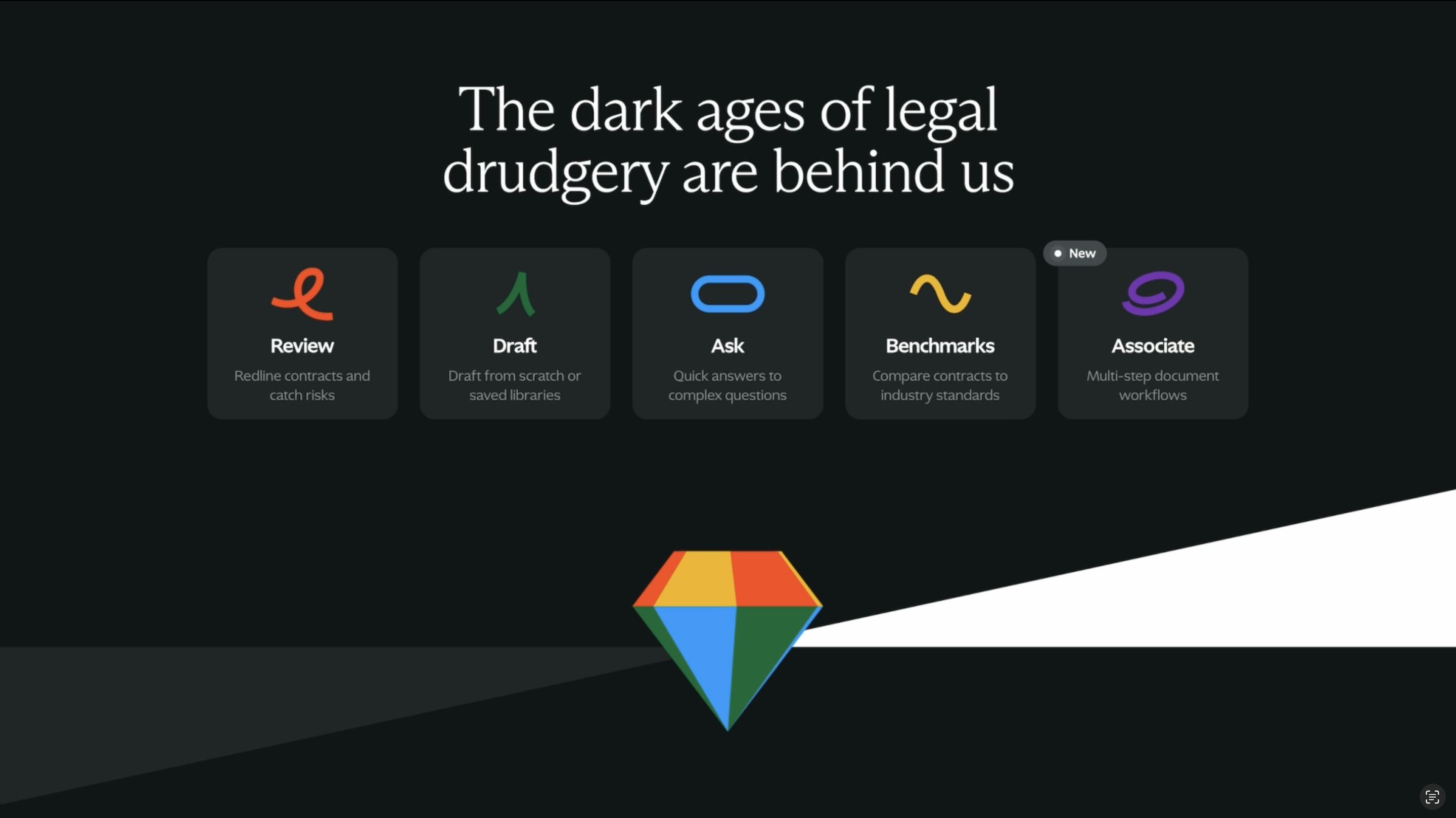
Image courtesy by Spellbook
What inspired the rebranding, and why did the company choose the name "Spellbook"?
The name "Spellbook" was actually coined by our Co-founder and CEO, Scott. He recognized that many lawyers grew up reading fantasy novels and playing games like Dungeons & Dragons, which involve reading, writing, and storytelling. Lawyers often have strong ties to literature and humanities, so the name serves as a callback to that early passion when they first dreamed of a career as a lawyer, doing work filled with strategy and adventure.

Image courtesy by Spellbook
Most brands targeting lawyers lean towards being very serious, reflecting the gravity of legal work. While understandable, it often ends up feeling boring. "Spellbook," on the other hand, is fun and imaginative, with ties to legal work and even the way lawyers write, which can feel like its own magical language.
The team also wanted to make Spellbook feel like a “tool” that could give lawyers magical powers, rather than something that was going to replace them.

Image courtesy by Spellbook
Because Spellbook started as a side project and evolved into a full-fledged, sophisticated suite of products, the old brand, including the logo and website, was quickly thrown together as needed.
As the product grew more complex and impactful, the team realized the brand needed to reflect its sophistication. This project wasn’t about appearing bigger than we were—it was about matching the brand’s look and feel to the top-tier quality of the product and marketing.
How did the project between you and Spellbook begin? You were initially hired for the website—how did you end up working on the client side as well?
We worked with Focus Lab on the brand work, and I led on website design and development. We worked closely together throughout the entire process.
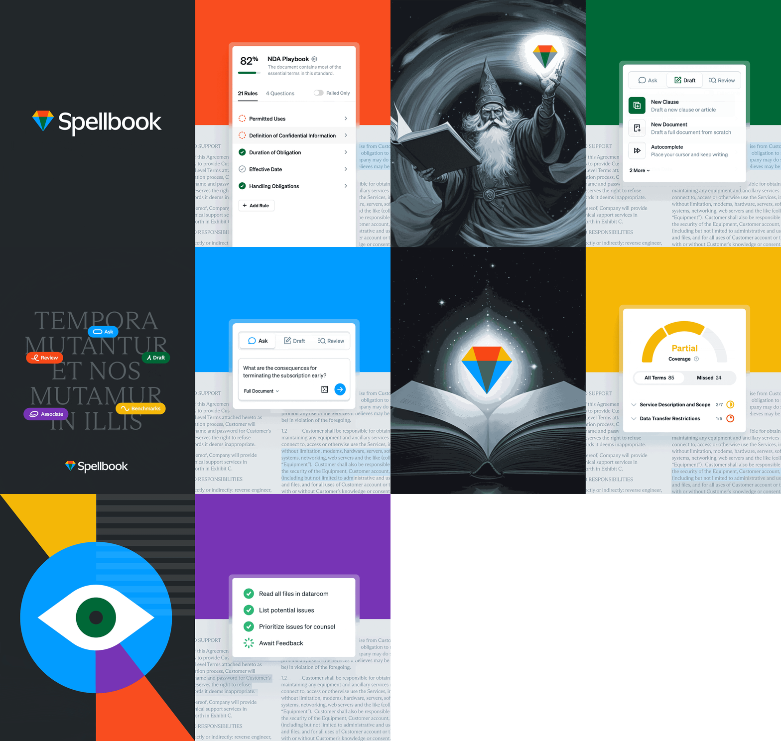
Image courtesy by Spellbook
Each week through the project, Focus Lab would deliver brand directions or refinements, and I’d immediately test those elements in web design to see if they worked—did they feel like Spellbook? Could they live as part of a full brand and website?
The tight feedback loop allowed us to explore deeply and refine what truly felt like Spellbook. We constantly asked ourselves: Does this stand out? Does it feel magical? We wanted every element to live up to the name "Spellbook" and its potential. That focus was at the heart of everything we created.
During the collaboration between you, Focus Lab, and Spellbook, did you face challenges, and how did you overcome them?
Every brand project, whether freelance, in-house, or agency-led, often starts with an ideal linear process: discovery, logo design, building the visual brand, and so on. But it rarely works that way. Designing a brand is like therapy for a company—it involves digging deep to uncover values and how they want to present themselves.
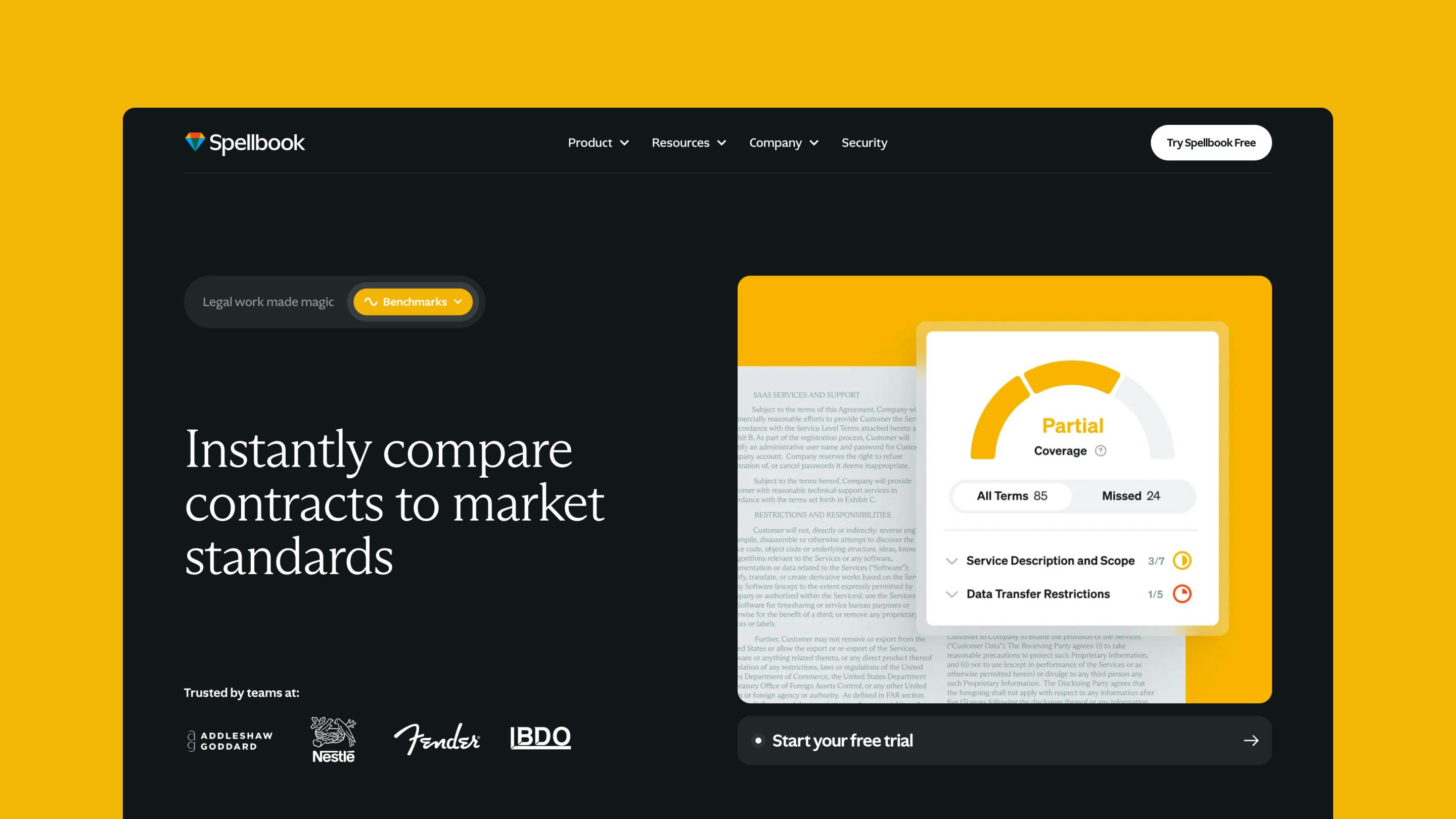
Image courtesy by Spellbook
With Spellbook, the challenge wasn’t a specific problem but accepting that the project needed more time and exploration than we initially planned. We aimed to design, develop, and launch in just a few months, but once we started, it became clear we needed to go deeper to create something meaningful.
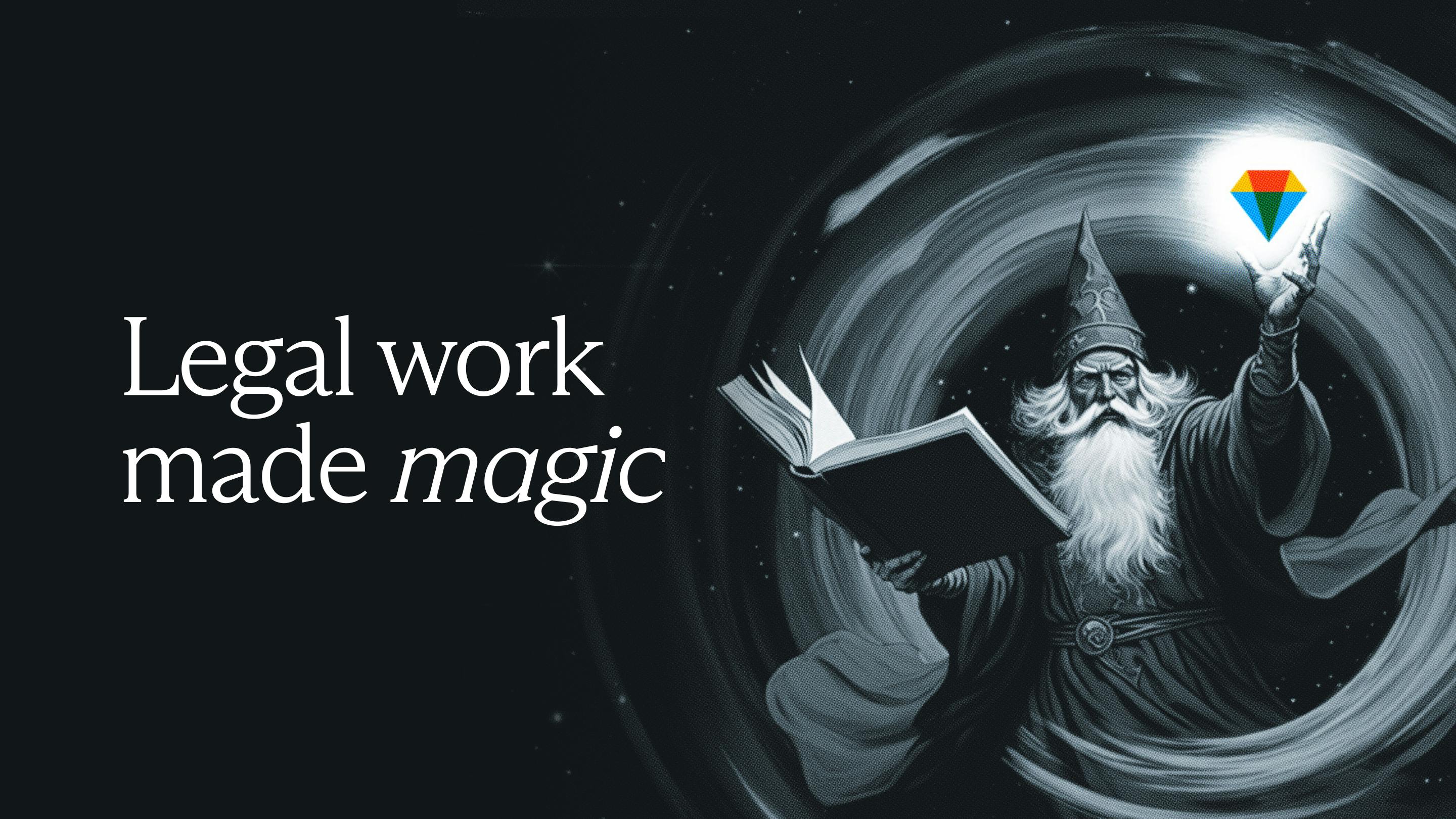
We explored extensively—creating 15 homepage designs, dozens of logos, and working with illustrators to find the right expressions for the brand. The process was time-consuming but rewarding, allowing us to craft something that truly resonates with lawyers. And even now, the brand continues to evolve as we create new elements.
How did Spellbook decide on the gem logo? What was the thought process behind choosing the final design?
The original Spellbook logo was also a gem. The idea was to represent a magical, precious tool—a special object a lawyer could hold in their hand. It symbolized something unique and valuable.
For the rebrand, we explored dozens of logo variations but were drawn to keeping the gem as a core element. Up until a few weeks before launch, the logo was entirely different. If you visit the website footer, you’ll see a hand holding a floating gem—that was the version we had been working towards for a long time. It embodied the concept of a magical object lawyers could possess.

Image courtesy by Spellbook
However, we found that this version didn’t feel strong enough as a standalone mark. While it was beautiful and meaningful, we reverted to a simpler design: just the gem and the wordmark. This felt truer to the company’s identity and a natural evolution of the original logo.
The hand-and-gem version still exists in some places, both as static and motion elements, and I’m glad we retained it—it’s a lovely nod to the design process.
Why does the new branding feature a vibrant palette with multiple colors? What do these colors represent?
We went with a highly saturated, bright palette consisting of five main colors. The logo itself uses four, but purple is prominently featured elsewhere. The palette serves multiple purposes. It draws inspiration from fantasy novels and retro gaming art, with nostalgic, vibrant colors that feel magical and immersive.
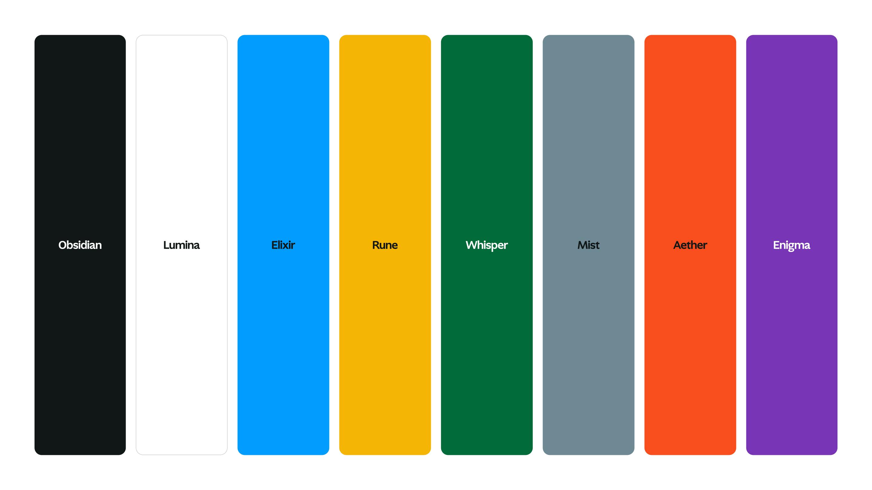
Image courtesy by Spellbook
At the same time, the bold colors differentiate us from other AI companies. Many stick to "Blurple," which signals innovation and trustworthiness but has become standard. We wanted to break away from that and create something unique and eye-catching.
Functionally, we’ve tied these colors to product features. For example, benchmarking is represented by yellow, while review uses red. These full-color floods make the features visually striking and help immerse users.
The bright palette emphasizes the fun and magic of Spellbook, and this energy is also reflected in the gem logo, which resembles a prism or light expanding, adding layers of interpretation to the brand.
How do the markup symbols improve user interaction with Spellbook features?
The markups began as a happy accident, created by Focus Lab as decorative elements during a branding round. When I saw them, I realized they could represent product categories. I mocked them up in the product menu, and when we shared it with the team, the reaction was instant: “It’s a suite of tools.”
The markups draw inspiration from editorial markup language—like proofreader’s marks you’d see in your high school English class, such as symbols to insert or omit text. While lawyers don’t use these marks day-to-day anymore, they’re a thoughtful callback to the profession’s history.

Image courtesy by Spellbook
Each markup is tailored to a feature. For instance, the review icon mirrors the “delete” mark and draft is based on the “insert” mark. We’ve also incorporated a wand in illustrations to tie back to magic, imagining the markups as something created with a wave of a wand. This magical idea inspired animations seen throughout the site, bringing the brand to life in an engaging way.

Image courtesy by Spellbook
With Spellbook’s incredible growth—like a 300% increase in customers and $20 million in Series A funding—how has this expansion shaped your priorities and strategy? How are you scaling to meet the needs of over 2,700 law firms and legal teams?
It’s actually closer to 2,700 now—lawyers love Spellbook! That’s what drew me to the company in the first place. We’re fortunate to have so many customers who are product evangelists, excited about how Spellbook improves their work. Driven by this massive growth, the team remains focused on constantly improving features, functionality, and delivering excellent customer service.

Image courtesy by Spellbook
The brand plays a big role in this. It’s about pushing for excellence on every front so lawyers can experience Spellbook in a magical way—whether they see us on social media, visit our website, interact with customer support, or hear about us in the news. The goal is to be excellent in everything we do and get Spellbook into the hands of as many lawyers as possible.
This rebrand reflects our commitment to investing in the company in a way that mirrors our customers’ joy and delight with the product. We want them to feel confident and proud to recommend Spellbook to their coworkers and peers.
With the new branding, how does Spellbook stand out from other legal tech companies that also use AI?
Spellbook was the first company to integrate a generative AI tool for lawyers directly in Word, allowing them to work seamlessly within their preferred platform. This pioneering attitude has been part of the company’s DNA since the beginning and continues to drive everything we do.
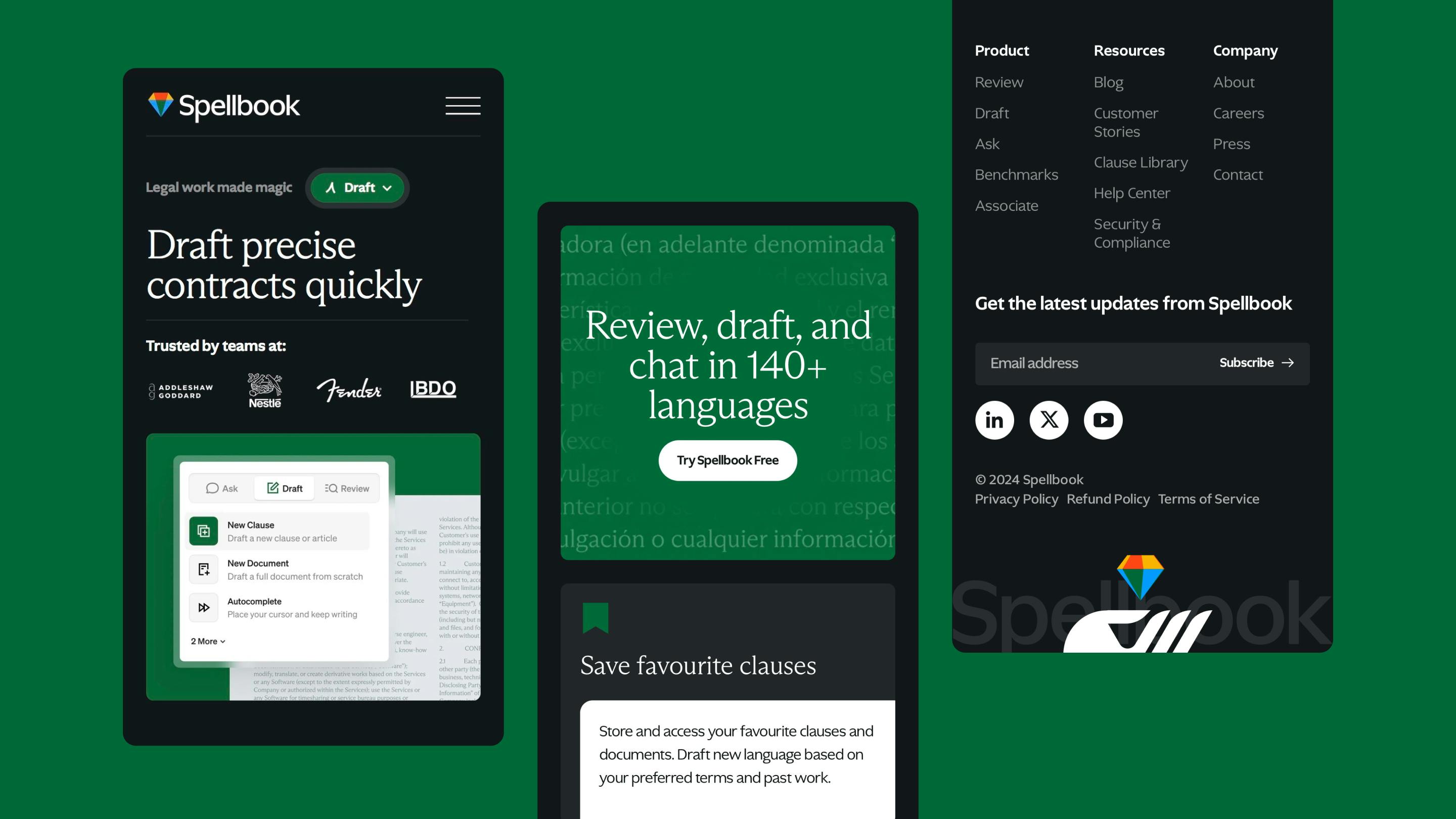
Image courtesy by Spellbook
Our goal is to build the most useful, efficient, and magical tool for lawyers—one that makes their work joyful and productive. A lawyer recently told me, “Spellbook helps me sleep better at night because I know I’m making fewer mistakes.” That confidence and support are what set Spellbook apart.
While many legaltech companies lean into serious, traditional branding, we take a different approach. Legal work isn’t boring, and lawyers aren’t boring. Spellbook is a magical tool that’s delightful to use, showing how AI and technology can transform work in positive and incredible ways.
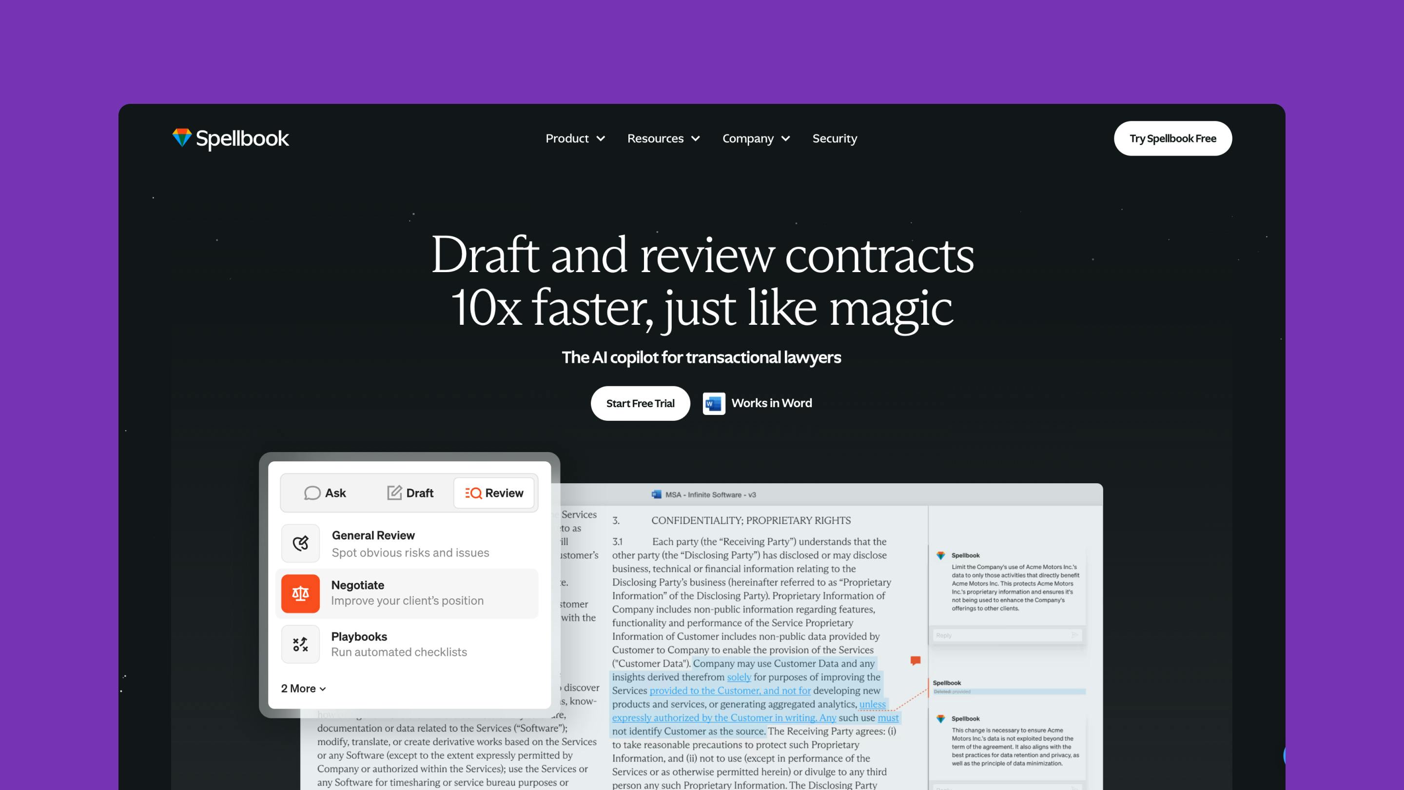
Image courtesy by Spellbook
Technology is the closest thing we have to real magic. Tools like Spellbook can give lawyers time back, reduce errors, and make their work more enjoyable. Our optimism for what technology can do shines through in everything we create, setting us apart from competitors and reinforcing the joy and magic that Spellbook brings to lawyers’ lives.
On a personal note, which part of the rebranding process are you most proud of? Are there any memorable moments or stories you'd like to share?
What I’m most proud of is how broadly we explored and how relentless we were in our iteration. Every step of the way, we tested, refined, and reworked until we were sure it was the right choice. That iterative process, driven by Scott, our CEO, set the tone for creating a memorable and powerful brand.

Image courtesy by Spellbook
On a personal level, the brand captivated me so much that I left my independent practice to join Spellbook full-time. I had been committed to working independently, but I was so inspired by the brand we were building and all the ways it could be expressed that I knew I wanted to be a part of it long-term.
There was so much joy in creating the website and collaborating with the team—it was clear this company had a unique energy. Having worked on more than 100 marketing websites and rebrands over the years, I can say:
There’s a special spark with Spellbook that sets it apart, and I have immense pride in the work we’ve done and continue to do.